

Music - 1 day 1 hour ago
Open Mike Night - Injection #1 & Saga Vol. 1
FTC Statement: Reviewers are frequently provided by the publisher/production company with a copy of the material being reviewed.The opinions published are solely those of the respective reviewers and may not reflect the opinions of CriticalBlast.com or its management.
As an Amazon Associate, we earn from qualifying purchases. (This is a legal requirement, as apparently some sites advertise for Amazon for free. Yes, that's sarcasm.)
Submitted by Critical Blast Staff on Fri, 05/15/2015 - 08:37
Maillaro: We really needed a break from all the EVENTS we’ve been covering lately, so we retreated to cover some Image stuff. This week, we hit Ellis’s new series, Injection, and flash back to look at the first Saga trade.
 Injection #1
Written by: Warren Ellis
Art by: Declan Shalvey
Colored by: Jordie Bellaire
Lettered by: Fonografiks
Published by: Image
Cover Price: $2.99
Maillaro: I have been a fan of Warren Ellis for a long time. He has a ton of cool ideas and almost always executes them brilliantly. When I read Injection, I actually saw a lot of his earlier works in it. Some Planetary, some Stormwatch, quite a bit of Global Frequency. But, I think there was a little too much exposition here and it was done in a way to keep the reader in the dark. I usually like some mystery and build in my comics, but there needs to be a solid foundation for the reader. For most of this comic, I just felt lost.
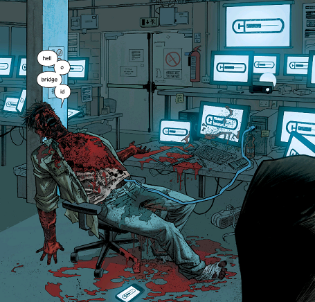
This comic starts with a woman named Maria Kilbride being held at a place called Sawl Ung Hospital, which seems more like a prison. Maria is obsessed with getting a sandwich. A mean looking woman (codenamed Control) comes to talk to her. Maria drops a lengthy exposition bomb about a group called Force Projection International. Maria and Control both work for an office inside FPI called The Cursus. Maria has what seems to be a tattoo of a needle on her arm. Control tells her that they have a missing person and a missing asset, and it’s FPI Cursus’s job to “find new exploitable resources.” Apparently at one time, Maria worked for a FPI office called the Cultural Cross Contamination Unit, and when they disbanded, many of these “finds” started to pop up. We get a flashback which introduces the characters of the former CCCU. Maria reaches out to one of them (Brigid) to help her track down this “find.” Maria believes it has something to do with “The Injection.” Brigid also has a tattoo of a needle on her arm. Maria’s search leads her to a beautiful empty area. Brigid’s own investigation leads her to a man who seems to have exploded with images of the needle tattoo all over his computer monitor
Meanwhile, we also introduced to a character named Robin Morel (who was also part of the CCCU). The Ministry of Time and Measurement wants to recruit him because he’s a Cunning Man. The Ministry of Time and Measurement recently took over something called Breaker’s Yard and the Breakers somehow cost Morel his mother, sister, and grandfather, so he refuses the offer. He also claims not to be a Cunning Man and walks off. I will admit, this whole segment was a big part of the turnoff of this comic for me. It really felt like random words thrown together and never quite tied into anything else in the issue, and that bugged me.
Weaver: I disagree. I think this issue had enough hints and suggestions to make me want to see more of it. A lot more of it.
Robin Morel had an ancestor named Cunning Morel who is of nigh legendary status. That came up in the same conversation, though admittedly later than the phrase Cunning Man came up. I think it’s also interesting that Brigid seems to be living somewhat off the grid...but still does favors for the Ministry. The last panel, with the guy exploded (yet still talking), was pretty exceptional to me. I like Brigid using the Standard Tech Support Response after seeing that, it continued down the character establishment path that started in the flashback.
Maillaro: For me, I think the real issue was there was just too many organizations, acronyms, and titles that I had to keep juggling. I was sort of reminded of a throwaway Doctor Who line from End of Time “You weren't there. In the final days of the war. You never saw what was born. But if the time lock's broken then everything is coming through. Not just the Daleks, but the Star of Degradations. The Horde of Travesties. The Nightmare Child. The Could-Have-Been King with his army of Meanwhiles and Neverweres. The war turned into hell! And that's what you’ve opened. Right above the Earth. Hell is descending.” It’s a lot of vague and cool sounding things...but when you give it much thought, it just sounds like random thoughts strung together.
I didn’t hate this comic, I just thought a lot of it could have been a little clearer. I don’t mind not getting answers...but I really wish I had a better idea what questions I should be asking, if that makes any sense.
Weaver: Moving past that, I liked this issue artistically a lot. In the first set-up parts, they did a lot of boxed text without the box, which gave the panels more space to work with and didn’t clutter the issue. I thought it was stylistically a good choice. I also like pretty much all the visuals. I like seeing some of the characters in the flashback and in the modern day and being able to guess elements of what happened from the way they changed, because they definitely looked like the same people, just after traveling a couple hundred miles of bad road.
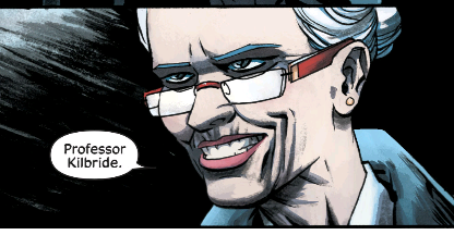 Maillaro: Declan Shalvey is a real talented artist. I would have bought this because of Ellis anyway, but Shalvey was also the artist for Ellis’s short Moon Knight run, so I was really looking forward to seeing what he would do here. I definitely agree with everything you said. This book looked great. The characters didn’t have anything distinctive to make them stand out, but you could easily tell who they were and what they were all about. I especially loved the creepy smile the first time we met Control. You pretty much knew what she was all about before she said a single word. That is perfect comic art for me.
OH! Before I forget, I also loved the whole conversation about the difference between British and English. That was a lot of fun, and definitely felt like classic Ellis. There was a lot of diversity among the characters, including the white characters not all just being generic “white dudes and dudettes.” Their cultural identities mattered...that is kind of rare for white characters.
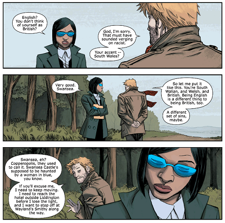 Weaver: I was going to bring that up too. Robin has an ear for accents, and when he meets people, he reasonably accurately guesses where they’re from. But I feel like that conversation had more weight than you think, because right now, it would be common for an Englishman to call himself an Englishman, and the person he’s talking to indicates that she’s surprised he doesn’t call himself British. I think it was a subtle hint to things going on in the world, especially since it seems some things went wrong after Robin and his colleagues left their steady government job.
Maillaro: I actually hadn’t considered that. See, this is why I like doing this column with you so much. It’s never “I HATE THIS, I LOVE THIS, LET’S FIGHT.” I think we usually find middle ground even on books we disagree about.
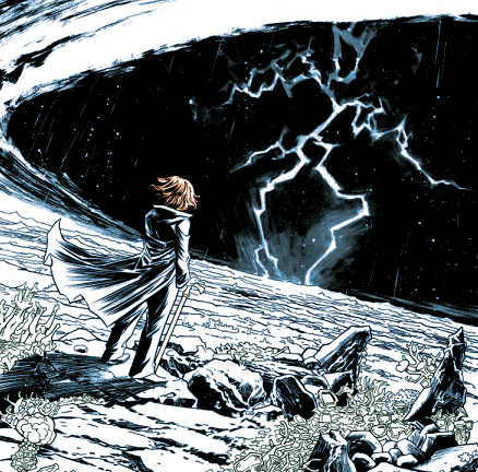
All in all, I thought there was a lot of cool stuff here, but I am just not 100% sold on the implementation. There probably could have been a little more action. The setups were great and often beautiful (I loved whatever Maria found), but I would have liked a little more clarity at times.
That said, a lot of recent Image books have “started slow” and quickly landed on my must read list, so I will probably give it another shot next month. It is Ellis after all.
Scores?
Weaver: I’m going with a 4.5 on writing because there were a few places that I think it could have been stronger, but a solid 5 on the art. All in all, I thought this was a strong first issue.
Maillaro: I’m going to go a little lower on the writing, just because I thought things could have been clearer at times. 3.5 for the writing. But I will stick with the 5 on the art. I am amazed Declan Shalvey has not been scooped up for a bigger project at this point. He has some huge talent.
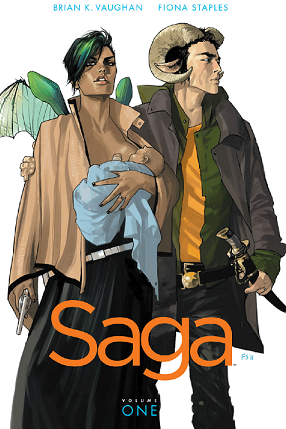 Saga Vol. 1
Written by: Brian K. Vaughan
Art by: Fiona Staples
Lettered by: Fonografiks
Published by: Image
Cover Price: $9.99(Digital, Comixology) / $9.00 (Print, Amazon)
Weaver: Well, that was certainly a comic. Saga is the tale of starcrossed lovers and their baby, Hazel. Her parents belong to two races that have been at war for forever, and still are at war, and so their union is frowned upon by members of both races, and by frowned upon, I mean everyone wants them dead. Not the baby, though. People are interested in the baby.
 Volume one follows our heroes as they make their escape from the planet Cleave, heading in an organic rocketship to parts unknown. It also covers a few other characters, like the bounty hunters The Will and The Strand and Prince Robot IV. Everything in this story setting and design wise was completely left field, and yet somehow, it felt like a pretty typical science fiction story, and I mean that in the best possible way. Dystopian future, kid who will one day be important, escaping armies by the skin of their teeth...it’s all done in familiar fashion, but with completely over the top set pieces. I loved this.
Maillaro: I hadn’t read the early issues of Saga in a while. I actually forgot how causally filthy this book could be. There is an entire issue that takes place on a sex planet, and you get to see some unique combinations here. As I read this trade, I kept chucking thinking “Fiona Staples is best known for this...and they still hired her to help relaunch Archie.”
 But, I would also say that even though you see a lot of graphic sexual images, there is a ton of heart here. This comic has a lot to say about the cost of war and personal relationships. I especially liked when we meet the Horrors. They don’t seem bitter about being killed, just kind of accepting that “Life sucks during war, and look what happened to us.” The sex also never feels quite pornographic. It just all seems like a natural part of the life and death struggles the characters are going through.
I also love the lettering they used to designate Hazel’s narration (with her reflecting on this events at a far later time). It seems to just go all over the panels, and I thought that gave the book a unique look and feel.
 Weaver: Yeah, Hazel’s narration was really good. That was nice stylistically.
About the sex...more often than not, the sex is pretty much the least important thing going on at the time. Yes, even on the sex planet. The Will walks past all sorts of depravity, and none of it phases him at all...well, until he gets offered a child prostitute. When Prince Robot IV was having sex with his wife, it became all about how he fit into his family and his father’s love of sending him off to some backwater. The Strand was topless the entire time she was on panel, but I didn’t feel that was sexualized at all.
So basically, it has a lot of sex, but the sex is just background noise. I can’t imagine someone reading this as a pure sex comic. It breaks a lot of other usual rules too, like having a scene of a character talking to someone on a comm while in the bathroom. And the Horrors were pretty gory too, but again, both of those are more background than integral to the plot.
Maillaro: Yeah, it’s sex and violence...without being sexy or violent. I have no idea how you can pull that off, but Vaughan and Staples pulled it off perfectly.
For me, it was also great to revisit the early issues of Saga and reflect on where we are now. The series has moved forward a lot, and the status quo is constantly changing. The “romance novel” that Hazel’s parents bonded over has a major role in the later issues.
I also love that Saga makes it clear “This isn’t quite what you’ve seen before.” Hazel says upfront that she doesn’t live an important live (though I think she’s lying about that). Exactly what this story is all about and where it’s going still isn’t clear 28 issues in, but it’s still a damn entertaining comic, and I can’t ask for more than that.
Weaver: It’s entertaining, and it’s different. It’s definitely not for everybody, but I actually think that some people who would normally be turned off by the extreme things that happen in it would actually like it since those things are so marginalized. Which is a pretty odd pairing.
Anyway, I’d give this two 5’s. Great writing. Great art. Great comic.
Maillaro: In a lot of ways, I am reminded of Fables, Sandman, or even Vaughan’s other “adult” book, Y: The Last Man. It is definitely very different from what people expect from a comic book. Beautiful, strange, deep and impactful. Definitely worth a pair of 5’s from me too.
Maillaro: So, I am thinking that next week we need to hit A-Force. It’s sort of the spiritual successor of Fearless Defenders which I miss so much. And definitely one of the Secret Wars tie-ins I am actually excited about.
Weaver: Sounds good. I’ll look around for a classic issue to torture you with.
Final Scores
|
Maillaro – Story (out of 5) |
Weaver – Story (out of 5) |
Maillaro – Art (out of 5) |
Weaver – Art (out of 5) |
|
|
Injection #1 |
3.5 |
4.5 |
5 |
5 |
|
Saga Vol. 1 |
5 |
5 |
5 |
5 |